Logo Design
Logo Design
Year:
2025
Technology:
XD/UX/UI Design
Categories:
Logo Design
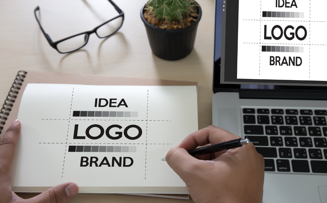
What is Logo Design?
In the world of branding, a logo is more than just a visual mark—it’s the face of a company, the symbol that represents its identity, values, and mission. Think of iconic logos like the golden arches of McDonald’s or the swoosh of Nike. These simple yet powerful designs are instantly recognizable and evoke strong emotions and associations. But what goes into creating a great logo? In this blog post, we’ll explore the art and science of logo design, its importance, the process behind it, and the impact it has on branding. By the end, you’ll have a deeper understanding of why logos matter and what makes them effective.
Defining Logo Design
Logo design is the process of creating a unique visual symbol that represents a brand. It combines typography, imagery, and color to convey a company’s identity and values in a simple, memorable way. A well-designed logo is not just aesthetically pleasing; it also communicates the essence of the brand and differentiates it from competitors.
Logo Design
Logos come in various forms, including wordmarks (text-based logos like Google), symbols (iconic logos like Apple), combination marks (a mix of text and symbols, like Burger King), and emblems (logos that integrate text into a symbol, like Starbucks). Each type serves a specific purpose and is chosen based on the brand’s needs and target audience.
The Importance of Logo Design
A logo is often the first thing people notice about a brand, and it plays a crucial role in shaping their perception. Here’s why logo design is so important:
First Impressions Matter: A logo is the face of a brand. It’s what catches a customer’s eye and makes them curious to learn more. A well-designed logo creates a positive first impression, while a poorly designed one can turn people away.
Brand Recognition: A logo helps customers identify and remember a brand. Over time, it becomes synonymous with the company’s products, services, and values. For example, when you see the Nike swoosh, you immediately think of athletic performance and innovation.
Building Trust: A professional logo conveys credibility and reliability. It signals to customers that the brand is established and trustworthy, which can influence their purchasing decisions.
Differentiation: In a crowded market, a logo helps a brand stand out from its competitors. It communicates what makes the brand unique and why customers should choose it over others.
Emotional Connection: A great logo evokes emotions and creates a connection with the audience. For instance, the Coca-Cola logo is associated with happiness and nostalgia, making it more than just a beverage brand.
The Logo Design Process
Creating a logo is a meticulous process that requires creativity, strategy, and collaboration. Here’s a step-by-step look at how professional logo designers approach their work:
1. Research and Discovery
The first step in logo design is understanding the brand. Designers conduct research to learn about the company’s mission, values, target audience, and competitors. They ask questions like: What does the brand stand for? Who is its ideal customer? What message does it want to convey? This information serves as the foundation for the design.
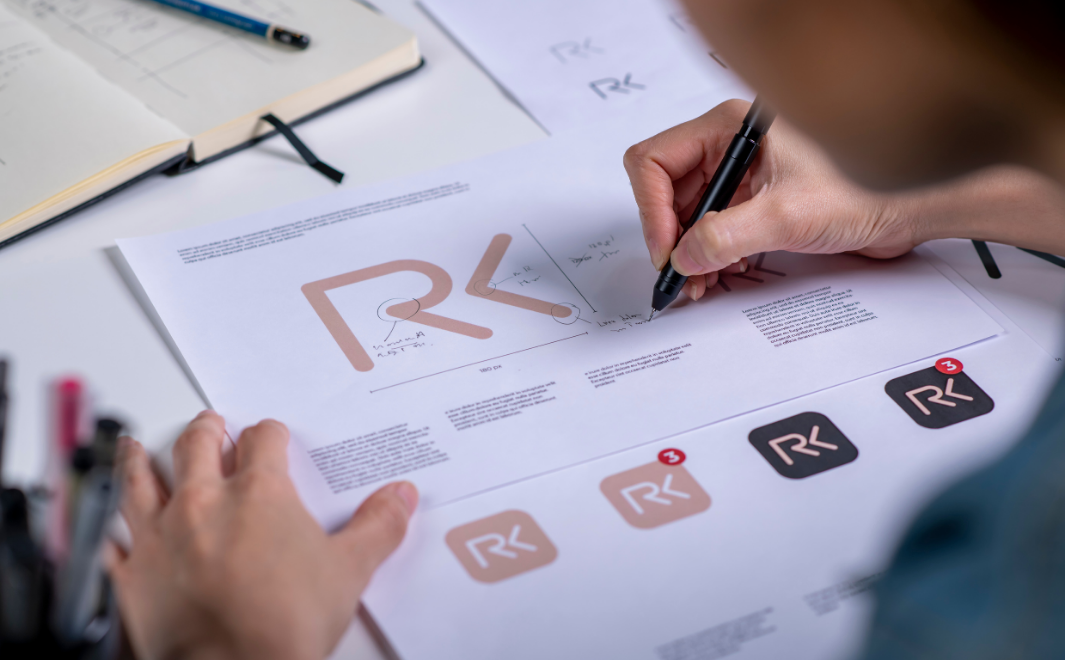
2. Concept Development
Once the research is complete, designers brainstorm ideas and sketch rough concepts. This stage is all about creativity and exploration. Designers experiment with different shapes, fonts, and colors to find a visual direction that aligns with the brand’s identity.
3. Refinement
After selecting the strongest concepts, designers refine them further. They focus on details like spacing, proportions, and alignment to ensure the logo is balanced and visually appealing. This stage often involves feedback from the client to ensure the design meets their expectations.
4. Color and Typography
Color and typography play a crucial role in logo design. Colors evoke emotions and convey meaning—for example, blue represents trust, while red symbolizes energy. Typography, on the other hand, sets the tone of the logo. A sleek, modern font might suit a tech company, while a playful, handwritten font could work for a children’s brand.
5. Testing and Iteration
Before finalizing the logo, designers test it in various contexts to ensure it works well across different mediums, such as business cards, websites, and billboards. They also check how it looks in black and white, as logos often need to be reproduced in monochrome. Based on feedback and testing, designers make final adjustments.
6. Delivery
Once the logo is approved, the designer delivers the final files in various formats (e.g., vector, PNG, JPEG) to ensure the client can use it for all their needs. They may also provide a brand style guide that outlines how the logo should be used, including color codes, spacing, and sizing.
Key Principles of Effective Logo Design
Not all logos are created equal. Some stand the test of time, while others fade into obscurity. So, what makes a logo effective? Here are some key principles:
Simplicity: A simple logo is easy to recognize and remember. Think of the Apple logo—it’s just an apple with a bite taken out, yet it’s one of the most iconic logos in the world.
Memorability: A great logo leaves a lasting impression. It should be distinctive enough to stick in people’s minds.
Versatility: A logo should work well in different sizes and contexts, from a tiny favicon on a website to a large billboard. It should also look good in color and black and white.
Relevance: The logo should reflect the brand’s industry, values, and target audience. For example, a law firm’s logo might use serif fonts and muted colors to convey professionalism and trust.
Timelessness: While it’s tempting to follow design trends, a great logo should stand the test of time. It should feel fresh and relevant even years after its creation.
The Impact of Logo Design on Branding
A logo is the cornerstone of a brand’s visual identity. It sets the tone for all other branding elements, from packaging and advertising to website design and social media. A well-designed logo can elevate a brand, making it more recognizable, trustworthy, and appealing to customers.
Consider the evolution of the Starbucks logo. Over the years, it has undergone several changes, but the core elements—the siren and the green color—have remained consistent. This consistency has helped Starbucks build a strong, recognizable brand that resonates with customers worldwide.
On the other hand, a poorly designed logo can harm a brand’s reputation. For example, the 2010 Gap logo redesign was widely criticized for being generic and uninspired. The backlash was so severe that Gap reverted to its original logo within a week.
The Future of Logo Design
As technology and design trends evolve, so does logo design. Here are some trends shaping its future:
Minimalism: Simple, clean designs continue to dominate, focusing on essential elements and removing unnecessary details.
Responsive Logos: With the rise of digital media, logos are being designed to adapt to different screen sizes and devices.
Dynamic Logos: Some brands are experimenting with logos that change based on context or user interaction. For example, Google’s Doodle is a form of dynamic branding.
Sustainability: As consumers become more environmentally conscious, brands are incorporating eco-friendly elements into their logos and branding.
Inclusivity: Logos are increasingly reflecting diversity and inclusivity, with designs that celebrate different cultures, genders, and identities.
Conclusion
In conclusion, logo design is a powerful tool for building and communicating a brand’s identity. It’s not just about creating a pretty picture; it’s about crafting a symbol that resonates with the audience, conveys the brand’s values, and stands the test of time. From research and concept development to refinement and delivery, the logo design process is a blend of creativity, strategy, and collaboration.
As the world of branding continues to evolve, the importance of a well-designed logo remains constant. Whether you’re a business owner, a designer, or simply someone who appreciates great design, understanding the art and science of logo design can deepen your appreciation for the craft. So the next time you see a memorable logo, take a moment to appreciate the thought, effort, and creativity behind it—because a great logo is more than just a design; it’s the heart of a brand.